
Mixing Citadel Colors
 Hey guys,
I have been working hard on the topic "how should Games Workshop colors be mixed". There are a lot of tutorials about this on the internet regarding color harmonics or complementary colors. The question remains what you should do with a color wheel and your tiny Citadel pot. Everyone knows that the colors look different if they are dry. Many of you have a dot of dry color on the pot to estimate the hue of the dried color.
But where the hell does the color lie on the color wheel?
Here comes my project into play:
What's the goal?
Arrange the typical Games Workshop colors on a color wheel that is independent from an observer and independent from a printer and/or monitor.
What has to be done?
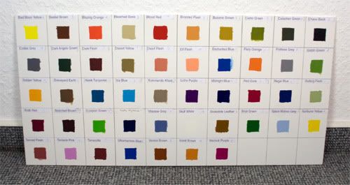
1. Apply the Games Workshop colors to a test chart.
2. Illuminate the chart with normed light.
3. Measure the reflectance spectrum of each probe.
4. Convert the spectrum to a suitable color space with equidistant perceivable color distances.
What I have done:
I applied my Games Workshop colors in 5 layers to a test chart. The brush was cleaned with extreme caution after the application of each color.
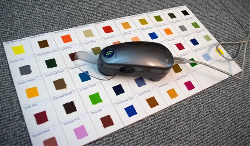
After that, each color was measured at five points with an Eye One spectro-photometer.
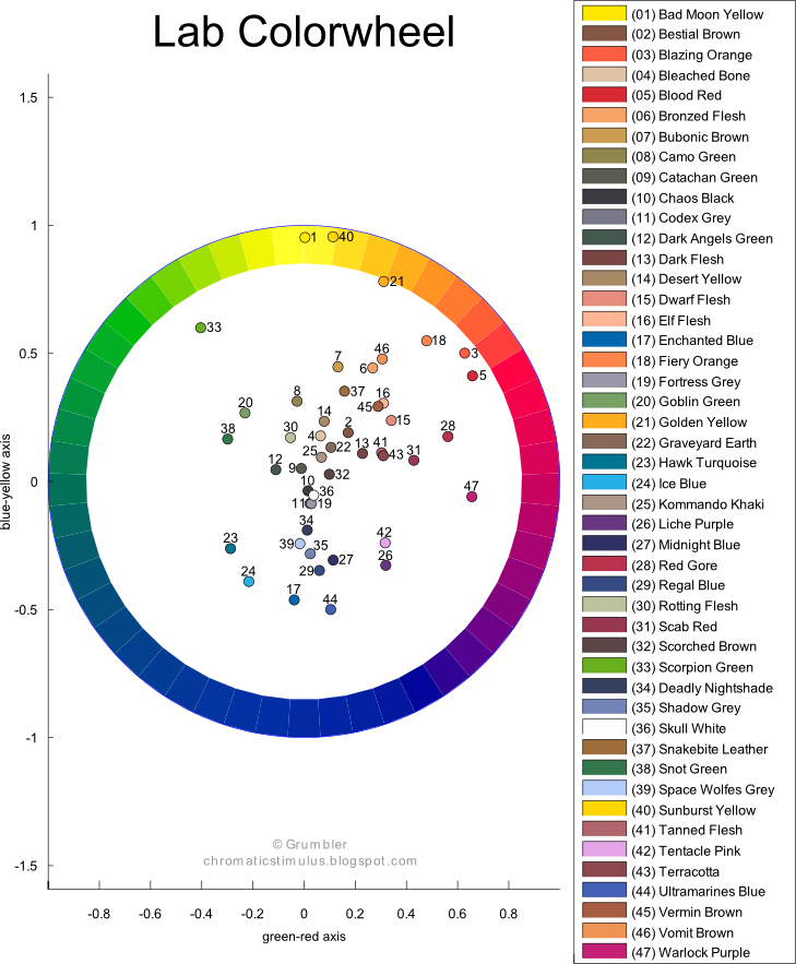
After that I transformed the measured reflectance spectra to the Lab color space (http://en.wikipedia.org/wiki/Lab_color_space).
From the two dimensional representation of the green-red axis and the blue-yellow axis we can conclude the mixing behavior of the colors. The line between two colors represents the mixing line. If the line crosses the center of the color wheel, than we have two complementary colors. I.e. 33 Scorpion Green and 26 Liche Purple or 24 Ice blue and 18 Fiery Orange. The distance from the center of the color wheel represents the chromaticity of a color.
In addition to that I produced a chart which incorporates the luminance. Connecting two colors in the diagram shows you whether the mixture will get lighter or darker.
For 33 Scorpion Green and 26 Liche Purple the mixture will get darker. The luminance of 24 Ice blue and 18 Fiery Orange will be roughly the same.
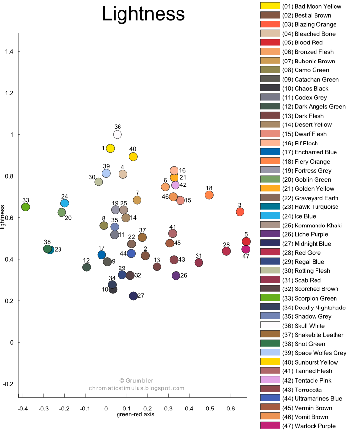
Obviously the colors should be arranged in a 3D space (L-axis, a*-axis and b*-axis) but such a diagram would be hardly usable at all.
You will find my good quality pdf charts here:
Color wheel
Lightness diagram
Grumbler
Post a Comment